
The everyday art and inspiration of artist Jennifer Georgeadis.
About Jennifer
Follow Azure Dragonfly on Twitter:

Drop me a line and say hello!
info@azuredragonfly.ca
June 20, 2017
While searching for reference images to sketch with, I came across a photo of this man.
With such an expressive face, full of great character lines, I couldn’t resist painting him!
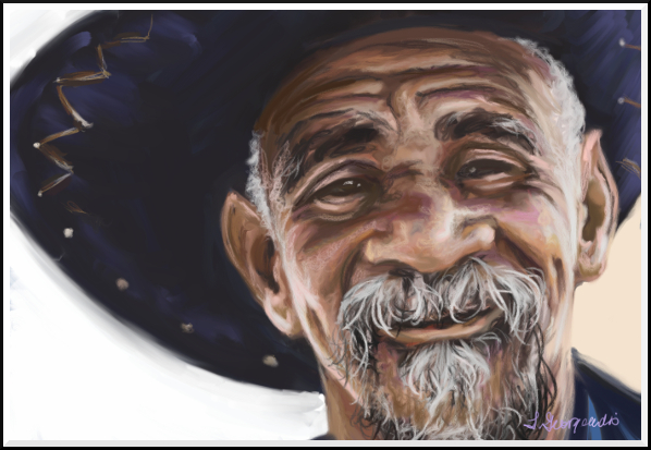 ©2017 Jennifer Georgeadis. 23cm x 16cm, digital oil
©2017 Jennifer Georgeadis. 23cm x 16cm, digital oil
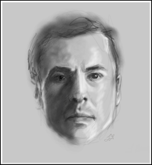
June 15, 2017
I never seem to go for very long without doing a bit of portrait practice, whether it’s a quick sketch
or a more involved painting.
I started this portrait with the intention of doing a fast value-study sketch for a gouache (an opaque, water-based paint) painting, but then got caught up in the enjoyment of using charcoal on textured paper and decided to develop it as a drawing:
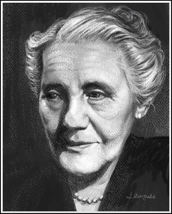 ©2017 Jennifer Georgeadis. 8cm x 10cm, digital charcoal on textured paper
I started this portrait with the intention of doing a fast value-study sketch for a gouache (an opaque, water-based paint) painting, but then got caught up in the enjoyment of using charcoal on textured paper and decided to develop it as a drawing:
©2017 Jennifer Georgeadis. 8cm x 10cm, digital charcoal on textured paper
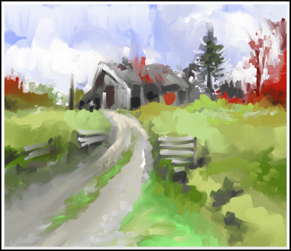
June 13, 2017
This painting was a quick, 10-minute abstract study of a very old barn in the country
near where we live. I was focusing on simplifying complex shapes and colours, and using
negative painting to define them.
 ©2017 Jennifer Georgeadis. 25cm x 21.5cm, digital oil
©2017 Jennifer Georgeadis. 25cm x 21.5cm, digital oil
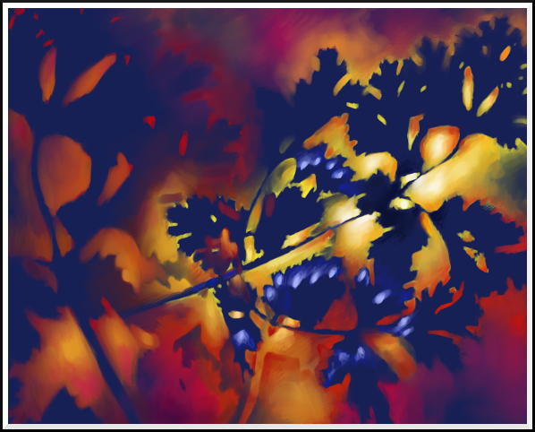
June 8, 2017
This was the second negative painting I did using the cilantro plant shapes. With this painting,
I worked more inside the negative shapes, and concentrated on strengthening the focal point
while sticking to the limited colour palette:
 ©2017 Jennifer Georgeadis. 25.5cm x 20cm, digital oil
©2017 Jennifer Georgeadis. 25.5cm x 20cm, digital oil
June 5, 2017
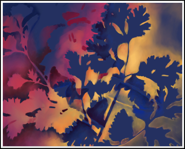
A while back I worked on a few negative paintings using cilantro plants as a reference for the shapes.
The cilantro plants (aside from being delicious!) were great to refer to because they gave me both
round curves as well as sharper angles to use in creating negative spaces. Here, I’ve stuck with
harmonious primary colours, blending them together when necessary:
 ©2017 Jennifer Georgeadis. 25.5cm x 20cm, digital oil
©2017 Jennifer Georgeadis. 25.5cm x 20cm, digital oil
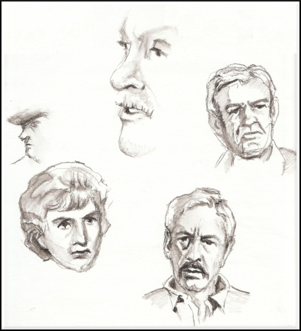
April 1, 2017
At the end of a day spent doing negative painting (which I’ll share later),
I thought I’d try a fast portrait from a movie still. Although the end result
wasn’t much of a true likeness of the gentleman I was sketching, I still
think the rendering turned out pretty well:
 ©2017 Jennifer Georgeadis. 19cm x 20cm, digital charcoal
©2017 Jennifer Georgeadis. 19cm x 20cm, digital charcoal
January 11, 2017
For years I've been trying to refine my field sketching skills. Anyone who's
followed my blog for a while will know that I keep coming back to that topic.
One of the most difficult aspects of field sketching is being able to quickly
and accurately describe what you're looking at, especially when the key elements
before you may be elusive and fleeting, such as a certain quality of light or
shadow, drifting clouds, animals, or groups of people. Developing fast sketching
techniques can also be helpful when you're travelling with others who may not
be as interested as you are in twenty minute stops to sketch a scene!
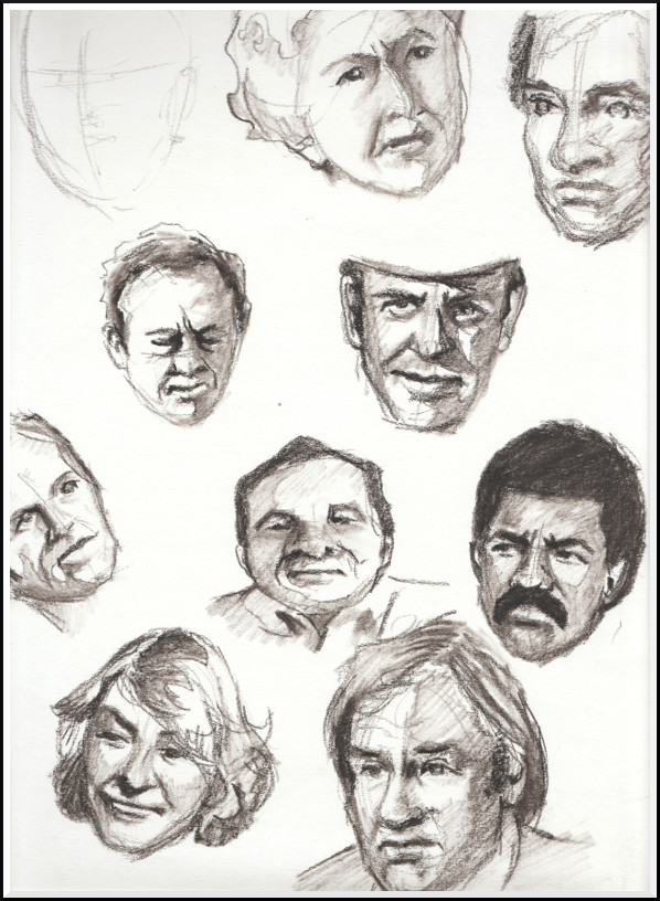
Over this past summer I returned to practising speed sketching faces in charcoal pencil. I kept the portraits small, usually 8/10 cm square, which allowed me room to create enough detail to be descriptive without getting too fussy. In the beginning I used TV as reference, mostly for convenience, and because the images could be paused for extra time to work while I improved on my speed. At first rendering a quick, decent likeness took way longer than I would have liked, often six or seven minutes.
I was happy with the line work and shading, but it needed to be much faster if I wanted to sketch in real time. I kept practising for speed, but I admit I was seduced by the tools – a medium charcoal stick, a graphite crayon and a large blending stick – which made some terrific lines and shadows and were great fun to use. The portraits became much more refined, though not any quicker to execute.

Gradually the process became faster as I became more accustomed to quickly measuring the distance of facial features, the angle of the head, and light and shadow.
©2017 Jennifer Georgeadis.
Not all of the sketches were successful, especially when I thought too much about fine rendering and not enough about basic shapes and light. The advantage of increasing the speed of my sketching is that if I'm doing it right, there isn't time to think too much! My plan is to take this practice out into the field (where there's no pause button!) and continue to develop my skills in real time.
Over this past summer I returned to practising speed sketching faces in charcoal pencil. I kept the portraits small, usually 8/10 cm square, which allowed me room to create enough detail to be descriptive without getting too fussy. In the beginning I used TV as reference, mostly for convenience, and because the images could be paused for extra time to work while I improved on my speed. At first rendering a quick, decent likeness took way longer than I would have liked, often six or seven minutes.
I was happy with the line work and shading, but it needed to be much faster if I wanted to sketch in real time. I kept practising for speed, but I admit I was seduced by the tools – a medium charcoal stick, a graphite crayon and a large blending stick – which made some terrific lines and shadows and were great fun to use. The portraits became much more refined, though not any quicker to execute.
Gradually the process became faster as I became more accustomed to quickly measuring the distance of facial features, the angle of the head, and light and shadow.
©2017 Jennifer Georgeadis.
Not all of the sketches were successful, especially when I thought too much about fine rendering and not enough about basic shapes and light. The advantage of increasing the speed of my sketching is that if I'm doing it right, there isn't time to think too much! My plan is to take this practice out into the field (where there's no pause button!) and continue to develop my skills in real time.
November 27, 2016
For many years I've wanted to take a pottery class and learn to throw pots on a wheel.
I've had a very small amount of experience with hand-building vessels from back in junior
high, but I've never worked on a pottery wheel before. I had the opportunity to take a
pottery class at the arts centre nearby, and we started working on the wheel during our
very first class – exciting and a bit frightening! The whole class (myself included) had
our share of small disasters, but for the most part, we ended up laughing despite it all.
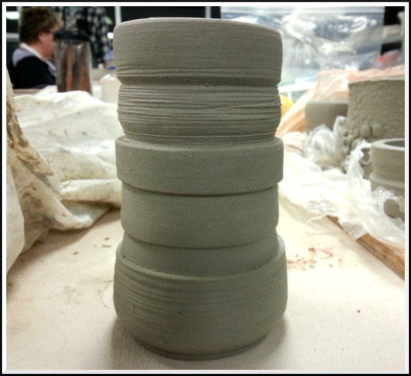
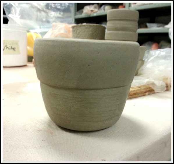
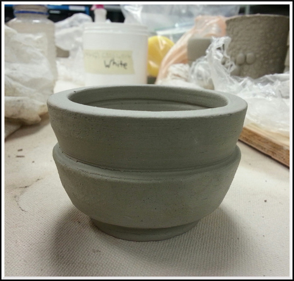
The first three vessels I threw had walls that were too thick, but I managed to take
advantage of that and make the surface a bit more interesting when I got to the carving
part. I carved a foot (base) on each vessel then flipped them over to carve out different
edges and textures for each one. This process is done on the wheel, and feels to me a bit
like what turning a piece of wood might be like. I really enjoyed this part of the process.
Here are the vessels after carving was complete:
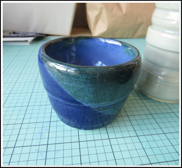
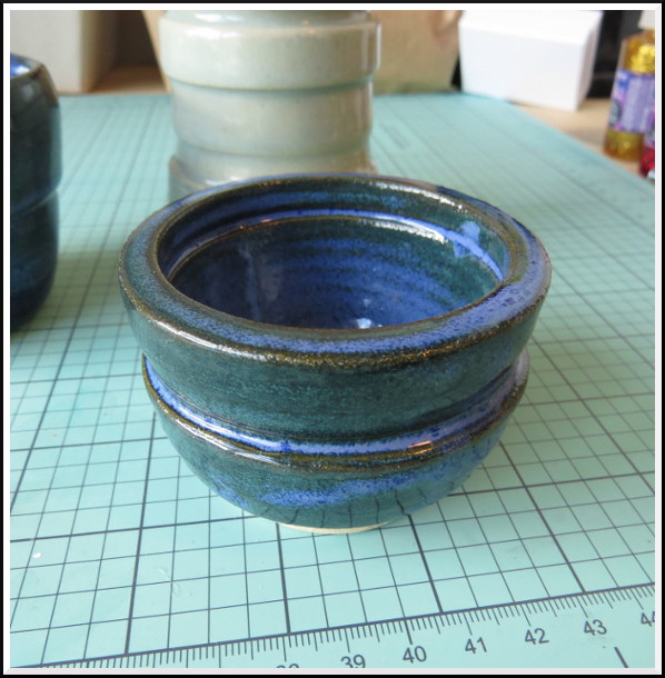
The glazing process was an adventure. Although we had a sample board to refer to when it came to choosing and mixing glazes. It seems there's only so much control you have in how a glazed piece of pottery will turn out. For those who need total control, the glazing process might be frustrating, but many in our class were happily surprised to see what the finished product was, even if it wasn't what they'd planned. Our instructor suggested that for pieces with a lot of texture a celadon glaze might be a good choice. My Stanley Cup-esque piece ;) seemed ideal to try this glaze, and I'm happy with the result. Because it's a simple glaze, it brings out the texture and fine particles in the clay.
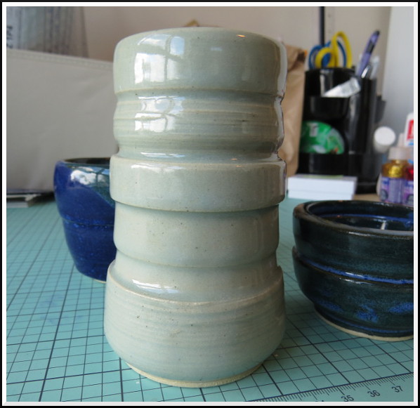
For the other two pieces I used two glazes, opal blue and celadon, dipped one after the other. The resulting mix had some very interesting sedimentary characteristics which I love!
 ©2016 Jennifer Georgeadis.
Halfway through the course I realized that I was making a technical mistake. For right-handed people like me, the majority of work on the vessel is done on the right side, or at the 3-o'clock position (for lefties it's at 9-o'clock). I'd been working on the wrong side, so I had to re-learn that element. I've been practising, and so far my vessels are starting to have the right thickness and shape. I'm planning to take another course in January to continue developing my skills, so there will be more pottery posts to come!
The glazing process was an adventure. Although we had a sample board to refer to when it came to choosing and mixing glazes. It seems there's only so much control you have in how a glazed piece of pottery will turn out. For those who need total control, the glazing process might be frustrating, but many in our class were happily surprised to see what the finished product was, even if it wasn't what they'd planned. Our instructor suggested that for pieces with a lot of texture a celadon glaze might be a good choice. My Stanley Cup-esque piece ;) seemed ideal to try this glaze, and I'm happy with the result. Because it's a simple glaze, it brings out the texture and fine particles in the clay.
For the other two pieces I used two glazes, opal blue and celadon, dipped one after the other. The resulting mix had some very interesting sedimentary characteristics which I love!
©2016 Jennifer Georgeadis.
Halfway through the course I realized that I was making a technical mistake. For right-handed people like me, the majority of work on the vessel is done on the right side, or at the 3-o'clock position (for lefties it's at 9-o'clock). I'd been working on the wrong side, so I had to re-learn that element. I've been practising, and so far my vessels are starting to have the right thickness and shape. I'm planning to take another course in January to continue developing my skills, so there will be more pottery posts to come!
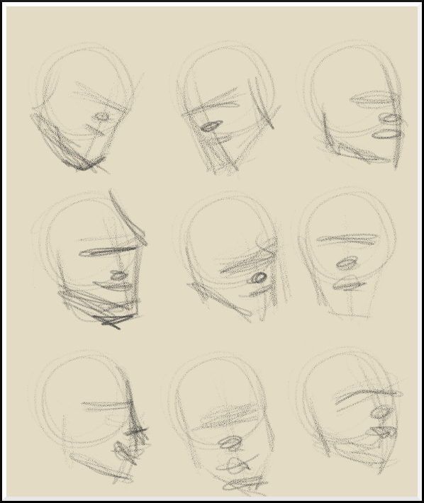
April 8, 2016
Recently, I watched an excellent video talking about how important repetition is in
sketching portraits. One of the elements that are so vital in successful sketching
is the position and general structure of the skull. Ideally, this should be one of
the first steps I consider before moving on to detail, but often I skip it. Here,
I’ve done a page of skull positions for practice. As always, returning to basics
is always good practice!
 ©2016 Jennifer Georgeadis. 16cm x 19.5cm, digital conté
©2016 Jennifer Georgeadis. 16cm x 19.5cm, digital conté
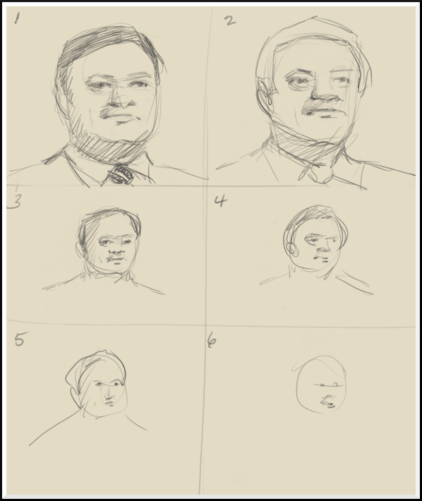
April 6, 2016
I had a little more success with my second attempt (still love what ends up
happening in the 5-second sketch, though!):
 ©2016 Jennifer Georgeadis. 16cm x 19.5cm, digital conté
<--- Newer Older --->
©2016 Jennifer Georgeadis. 16cm x 19.5cm, digital conté