
About Jennifer
Follow Azure Dragonfly on Twitter:

Drop me a line and say hello!
info@azuredragonfly.ca
January 15, 2016
The last week or so we've spent working on a menu for our game. The menu gives you options for starting a game, ending one, and setting up the display and controller options. From there we've worked on proper loading of levels including loading screens. It's not really a big secret for most game developers that saving and loading levels is a pain to code, because all the data you've stored about the prior level needs to be cleared out, reset and reloaded. There's a lot more to it than it sounds of course, when you take into consideration memory which has been allocated and optimized in a threaded game engine. Enough about that, I don't want to think about it anymore!
Designing game levels has been tricky. How about a metaphor? I would like to say that level design is like designing a playgound: add a swing, a slide, some climbing rope and walls and voila, instant fun! Unfortunately, I find it's more like baking a cake: you can include some delicious ingredients like sugar, icing, fruit, but unless you know what quantities to use, your cake will be a disaster. Fortunately, you can buy cakes or build on existing recipes. While it's true you can build on existing game designs, which games have been doing since the 1960s, you'll still need to make the level design make sense and be exciting for your game.
To help with our level design, Jen and I decided it might be helpful to build a concept sketch of what we would like our levels to contain. This is only 1/8th of the full image, but it gives us an idea of how many layers this level will have:
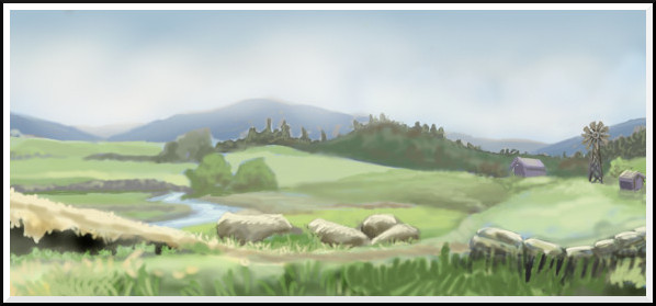
From this image we can start to imagine what sorts of experiences the player will encounter.
-Demetrios
January 13, 2016
My first project was to make a set of 4 coasters. I printed out the designs, then transferred them onto each plain coaster by blackening the back of the paper with charcoal, then retracing the design onto the wood:
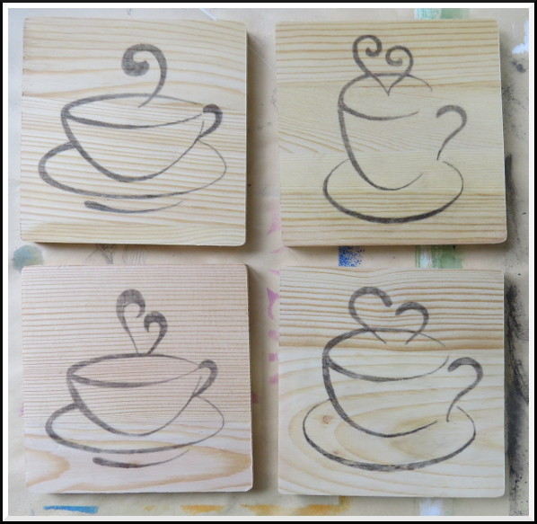
For each design, I began with the fine-tipped tool and burned in the outline:
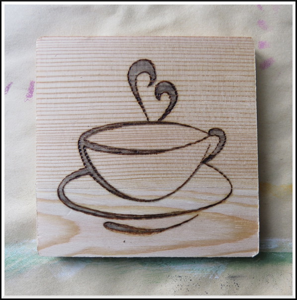
I filled in the outline with the rounded point. By this time my studio was beginning to smell a bit like a campsite! To protect the wood surface from spills and make them more durable, the coasters were painted with three coats of clear wood varnish (thanks to my dear husband!). Here are the finished coasters:
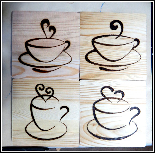 ©2016 Jennifer Georgeadis. 4 x 11cm x 11cm, wooden coasters
January 11, 2016
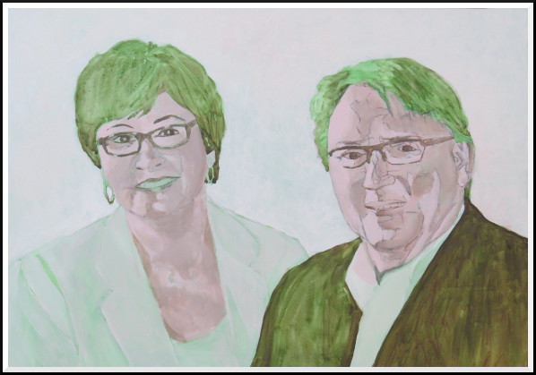
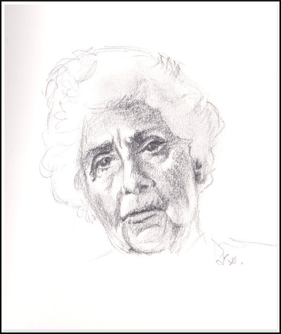
It’s perhaps most challenging to paint people you know because you know what features make them who they are, and you’re that much more invested in getting it just right!

The final version of the portrait:
 ©2016 Jennifer Georgeadis. 41cm x 30.5cm, acrylic on gessoed board
January 8, 2016
 ©2016 Jennifer Georgeadis. 41cm x 30.5cm, acrylic on gessoed board
January 6, 2016
As the image to be painted contained so many reds in the flesh colours, I began with a green underpainting over the pencilled drawing:
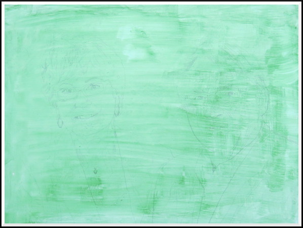
This is an excellent way to make the complimentary reds really sing later in the painting. I then painted in initial flesh colours and darker landmarks:
 ©2016 Jennifer Georgeadis. 41cm x 30.5cm, acrylic on gessoed board
Next up: further development of flesh colours, and painting the clothes!
January 4, 2016
We recently settled on a colour palette for our game levels. Let me explain:
The term palette of course refers to an artist's tool where colours can be mixed to produce millions of other colours. In a game environment, careful choice of colours and colour groups help describe mood, weather and time of day, and creates uniformity and balance.
The same principle applies for photography, film and digital graphics. Think about the original Star Wars trilogy and how in each film there was a collaboration between set designers, costumers and cinematographers to use the same sort of palette in sections and locations throughout. Tatooine was a desert, so they used browns and tan colours. The Empire's entire motif was black, white and grey. The ice planet Hoth was white and gray, Dagobah had earthy colours - browns and greens, and Cloud City was designed using whites, oranges and reds.
In the early days of game-making, choosing a palette had technical limitations. Early computers could only display x number of colours on the screen at any time so artists had to choose wisely - which 8 colours do I need for characters? Which 32 colours for a landscape?
The technical limitations for on-screen colours are gone nowadays, so choosing a colour palette for a computer game is an entirely artistic choice.
There are some fantastic articles on colour palettes in games here:
Color in games: An in-depth look at one of game design's most useful tools
and from the creators of Journey:
Video: Deconstructing the art design of Journey
Here is the colour palette Jen and I have decided on for our game:
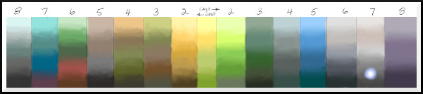
Each vertical stripe is the range of colours which will dominate in that level. In our game there are two characters which will start in the same environment, but will head in different directions, east and west. The environments they will explore are quite different, as you can see by the difference in palettes.
-Demetrios
December 9, 2015
This was meant to be a quick rendering using broad, simple strokes of colour.
As you can see, I got caught up in the details again, and worked much of the simplicity out of it.
Still, there are parts I like. I’ll have to give simplicity another try, though!
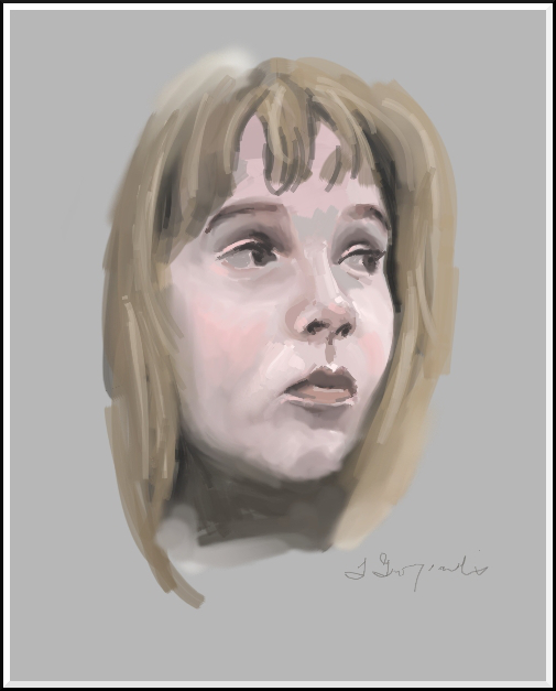
©2015 Jennifer Georgeadis. 8cm x 10cm, digital oil
December 4, 2015
One of the projects I’ve been working on recently is a portrait for a friend. Since the portrait is a Christmas gift and there’s a distinct possibility the recipient will occasionally be reading my blog, I’m unable to post my progress until after the holidays. My recent work drawing and painting faces and facial features has been practice both for this project as well as study in general.
Today I’m taking a break to work on another quick little sketch:
©2015 Jennifer Georgeadis. 7.5cm x 10cm, graphite on sketchbook paper
November 27, 2015
It's that time of year again where things get busier than usual for me. In addition to my daily studio practice, commissions and ongoing projects, I'm attempting to make gifts for almost everyone on my Christmas list. Making gifts is way more rewarding for me than trudging around a mall along with thousands of other people, but it definitely takes more time. My plan is to really knuckle down and get these gifts done in enough time to actually have some breathing room before Christmas (one can dream, right?), so during December, the blog may be a bit less regular than usual so I can try to achieve my goal. The up-side of this is that I will likely have more game art to blog about with my husband Demetrios. Our work has been progressing steadily on in the background, but I'd like to take the opportunity to share more of what we're doing as we go.
For today, I've been working on sketching another nose, keeping the sculptural elements of my recent clay work in mind:
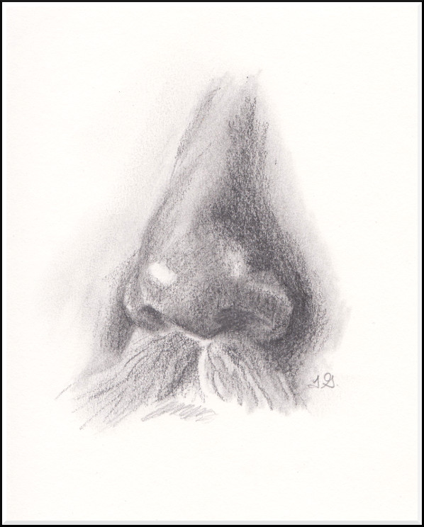
©2015 Jennifer Georgeadis. 10cm x 14cm, graphite on sketchbook paper
November 25, 2015
I had better luck today with a nose:
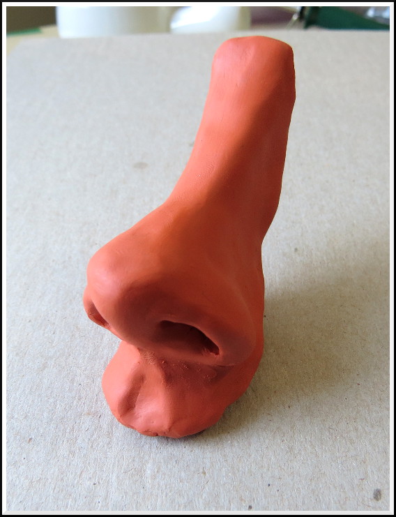
©2015 Jennifer Georgeadis. 7cm x 12cm, modelling clay