February 8, 2016
Here is another set of gestures I drew to develop a drawing of a woman playing an
instrument. The following are my first, third and fifth try of the sketch. Notice
how the lines used become fewer and simpler as I go - proof that this exercise
really helps!
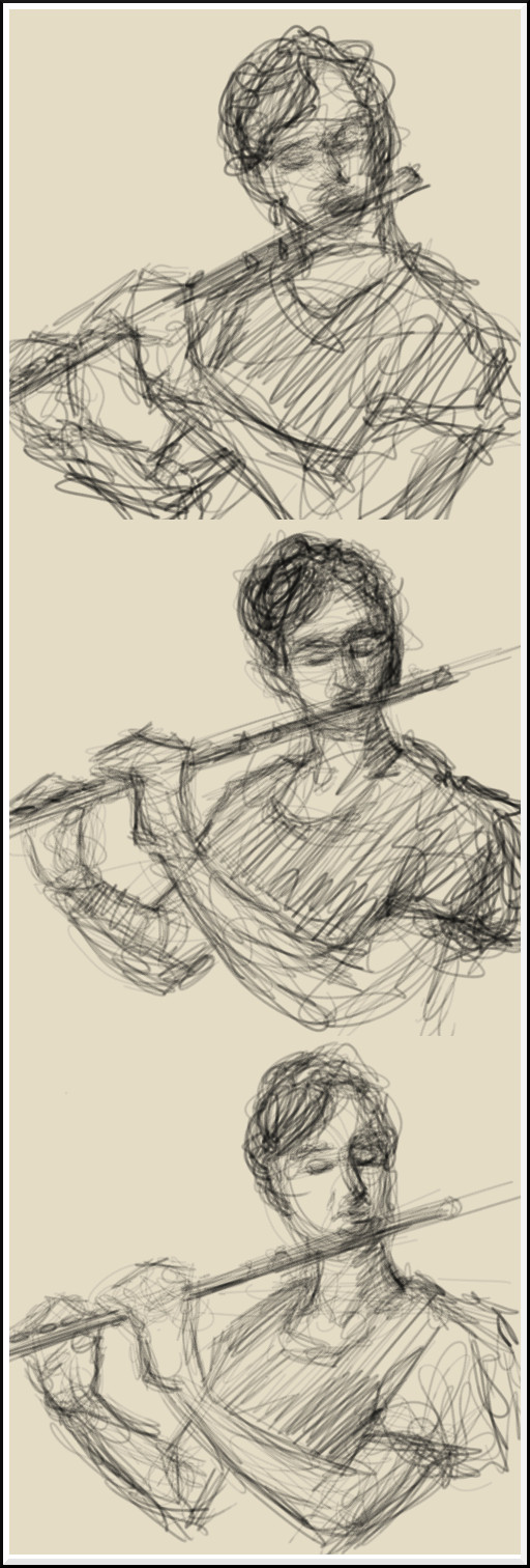
©2016 Jennifer Georgeadis. 12cm x 36cm, digital graphite

©2016 Jennifer Georgeadis. 12cm x 36cm, digital graphite
February 5, 2016
For the past few weeks I’ve been working on a series of gesture drawings using a wide
range of subject matter. For each drawing, it’s taken quite a few tries to get just the
right look. As always, practice and repetition helps immensely, and my recent work
sketching for the 8 minute challenge went a long way towards helping me develop a style
I was happy with. Here is one subject I tackled in three consecutive sketches:
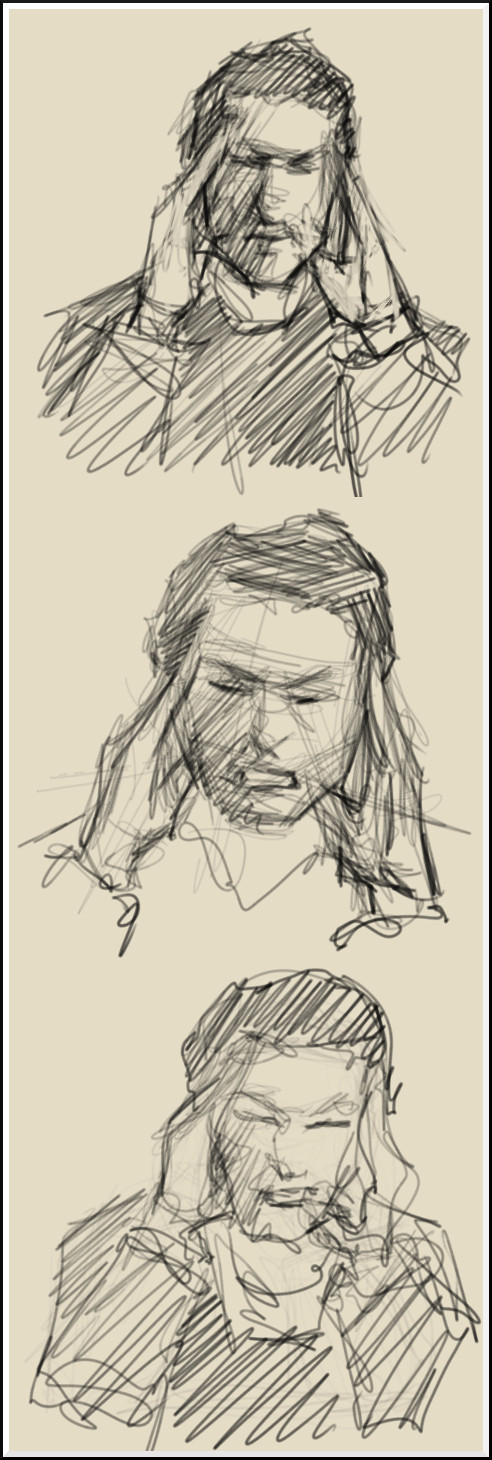
©2016 Jennifer Georgeadis. 12cm x 36cm, digital graphite

©2016 Jennifer Georgeadis. 12cm x 36cm, digital graphite
February 3, 2016
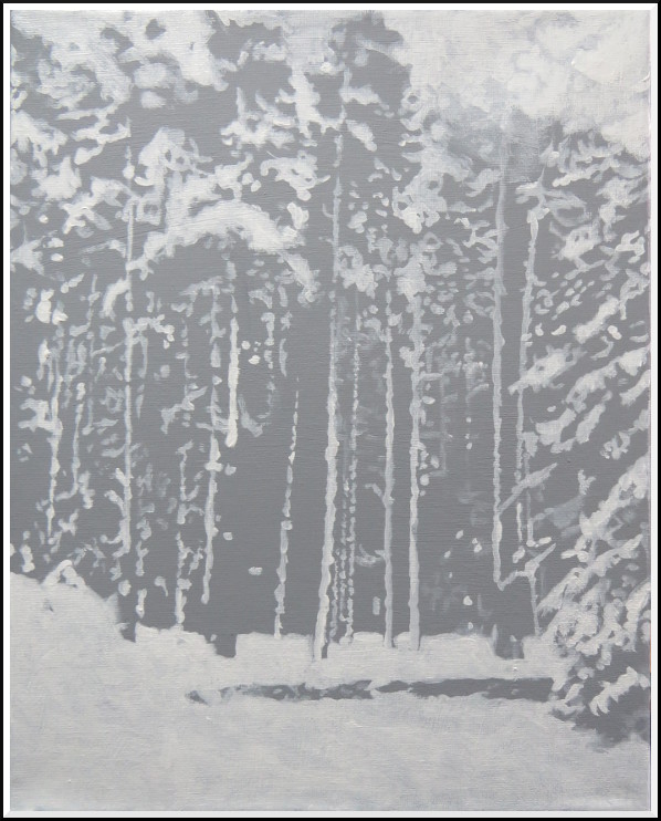
I recently was asked to create a painting based on a rather low-resolution reference
photo taken from a cell phone (not an ideal reference!). The image was a stand of
trees heavily laden with snow. Since I had very little in the way of detail to reference
in the image, I decided to concentrate on the range of values in the image, and the
larger shapes that were created in the contrast between white snow and shadow.
With that in mind, it occurred to me that my recent work using negative painting
would be an ideal way to tackle this image and keep me interested!
Here is the first stage of the painting. I painted the entire canvas with a mid-value grey, and then began with the lightest greys:
To establish some of the landmark shapes in the image, I then painted in a very dark-value grey:
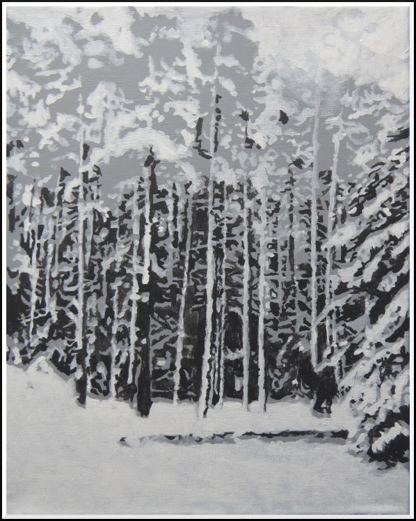
In order to establish depth, I painted in a mid-to-dark-value grey, primarily in the centre of the image. The last step was to refine the values after standing back and assessing the painting. At this point I found that there were some areas that needed to be pushed back with black, and others that needed strengthening with pure white.
Here is the final version of the painting:
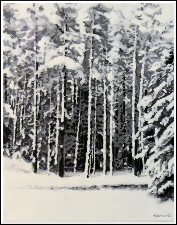 ©2016 Jennifer Georgeadis. 28cm x 35cm, acrylic on canvas
Here is the first stage of the painting. I painted the entire canvas with a mid-value grey, and then began with the lightest greys:

To establish some of the landmark shapes in the image, I then painted in a very dark-value grey:

In order to establish depth, I painted in a mid-to-dark-value grey, primarily in the centre of the image. The last step was to refine the values after standing back and assessing the painting. At this point I found that there were some areas that needed to be pushed back with black, and others that needed strengthening with pure white.
Here is the final version of the painting:
 ©2016 Jennifer Georgeadis. 28cm x 35cm, acrylic on canvas
February 1, 2016
Here’s my second attempt for the 8 minute drawing challenge.
Already this exercise has noticeably improved my sketching in other areas!
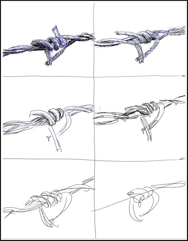 ©2016 Jennifer Georgeadis. 22cm x 28cm, digital pencil and ink
 ©2016 Jennifer Georgeadis. 22cm x 28cm, digital pencil and ink
January 29, 2016
Guest Post by Demetrios Georgeadis
Because we're not using a tiling system for our levels, Jen will be hand painting every one.
Some of our outdoor levels are 16 screens wide, so for our large outdoor levels we worked out a procedural system to place trees and
foliage.
Generating something procedurally means that the programmer writes a formula which relies on random numbers and conditions to create something. This is how our formula works; last week I showed you a level with coloured parallax strips which we move at different speeds to create a sense of depth:
Our procedural formula travels each of these strips and places a piece of foliage down, spaced randomly. Each of these pieces of foliage are scaled to the right size based on the distance value we have assigned to the strip. The formula will follow the contours of the strip as well, and take into account if the strip becomes a hill or a valley.
Here is that same level with foliage added:
Adding trees uses a slightly different variable in the procedural formula:
This was a REALLY simple example. The formula contains quite a bit more than what I just showed you. We can mark off regions and specify how dense we want the foliage or trees, and we can also alter the types of trees we want in different areas. Generally this should give you an idea about procedural generation of assets.
January 27, 2016
I’m taking part in Jake Parker’s 8 minute drawing challenge:
This is an excellent exercise to help artists draw more quickly and accurately in a limited period of time. It really helps train your eye to see what’s important and iconic in an image so that you can describe it very quickly and efficiently. Here’s my first try (very gestural, but a good start):
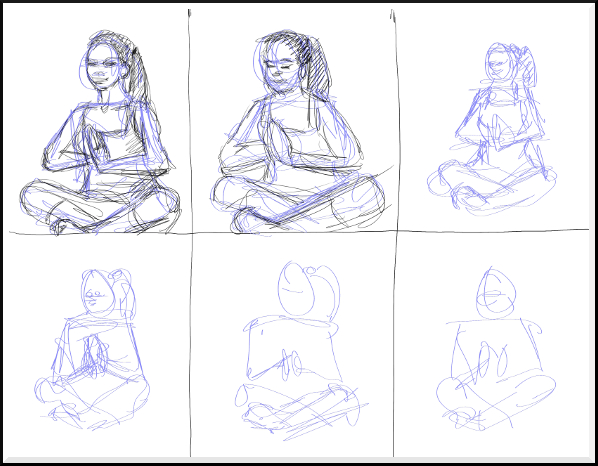 ©2016 Jennifer Georgeadis. 28cm x 22cm, digital pencil and ink
This is an excellent exercise to help artists draw more quickly and accurately in a limited period of time. It really helps train your eye to see what’s important and iconic in an image so that you can describe it very quickly and efficiently. Here’s my first try (very gestural, but a good start):
 ©2016 Jennifer Georgeadis. 28cm x 22cm, digital pencil and ink
January 25, 2016
This Christmas gift project was a bit of a mash-up of techniques. For this wooden box
I created a digital design for the lid, then printed it onto printable fabric that can
be ironed onto any porous surface. After fusing the fabric onto the lid, I stained it
to give it an aged look. The last step was to decorate the edges and sides of the box
with some woodburning designs. The last photo shows a little surprise I added to the
inside of the box.
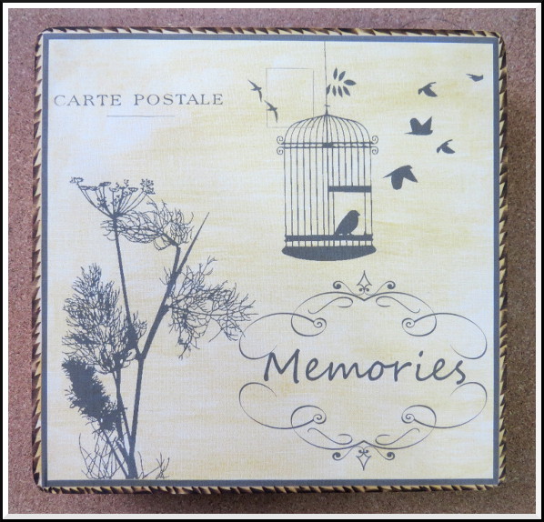
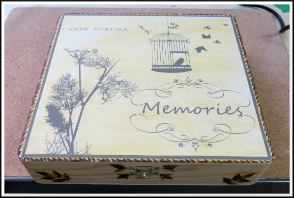
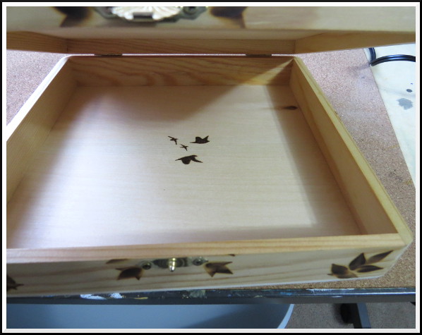 ©2016 Jennifer Georgeadis. 24cm x 24cm, wooden box with clasp


 ©2016 Jennifer Georgeadis. 24cm x 24cm, wooden box with clasp
January 22, 2016
Guest post by Demetrios Georgeadis
I encountered some issues this week which made me sad/crazy. I discovered that game controllers identify
themselves differently between Linux and Windows. For example, the green button on the Xbox 360 controller
has a different identifying button number than it does in Linux. This means I know have to code in extra
parts for each operating system. Not a big pain I guess, but something satisfying to whine about
because many PC gamers have problems with controller support :) . Logitech branded controllers have some other issues
under Linux which I won't get into now until I research them more.
I also had an issue where my sound fx play fine under Linux but not under Windows. This is a much bigger problem that I haven't been able to diagnose yet. More on that next week...
Back on September 3, 2014 I made a quick video to show parallax scrolling:
The reason I made this video was to demonstrate how we can achieve the look of a 3-dimensional world in a 2-dimensional game. Cartoons have been doing this for decades. An artist draws somes scenery far off in the distance which moves across the screen slower than the scenery close to the camera. This gives the illusion of depth.
The reason I'm bringing that video up now is so you have some context for what's going on in today's video. In this video I'm showing some of the level design prototyping that I'm currently performing. Level design involves placing platforms, props, characters and challenges for the player to encounter, but in a layout that's pleasant to see and pleasant to play:
This is a test for the first level of our game. What you're seeing is the 'angry bird' we're using as our test character (place holder), and 11 parallax layers. The mountains and every strip of colour in front of them is a different parallax layer. On the layer with the bird character I've inserted a concept art placeholder that Jen has made as a moving platform, and also green strips seemingly floating in mid air. These green strips are also static platforms; in the final game they will look like tree branches or rocks.
To prototype a level and get a feel of how it will play, I've been using temporary platforms and graphics to interact with my character. When I've decided I like the position of the platforms, Jen will make an appropriate graphic to replace it with.
Without giving away too much I can tell you that the first 5 green strips the character jumps onto will become a tree after I'm satisfied with their positioning.
Also posted at: http://walkinghibernation.ca/blog/index.html
January 20, 2016
I thought I’d share a sketch that I did during the planning process of one of our game levels.
I find it helpful to do a quick thumbnail-type sketch of the entire game level first, disregarding
fine detail and precise scale, and focusing more on characteristics of the terrain that will
describe the environment. If there are key focal areas in the level, this is where
I make note of them, along with plans for how many individual layers will be needed for each
section. This whole process (ideally) will only take 5-10 minutes, and will be followed up by
a more detailed plan drawing using the appropriate colour palette that we decided on in the
beginning.
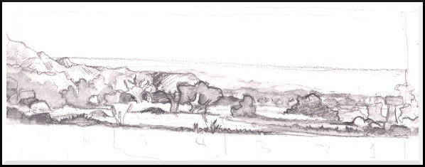 ©2016 Jennifer Georgeadis. 29cm x 11cm, watersoluble graphite on sketchbook paper
 ©2016 Jennifer Georgeadis. 29cm x 11cm, watersoluble graphite on sketchbook paper
January 18, 2016
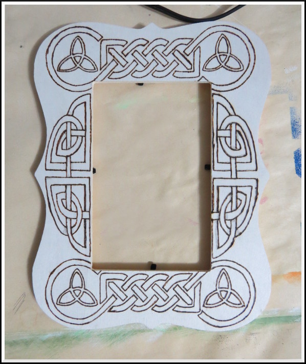
My second woodburning project was a Celtic-knot design on a wooden picture frame. Here’s the initial burned outline:
Here’s the finished product:
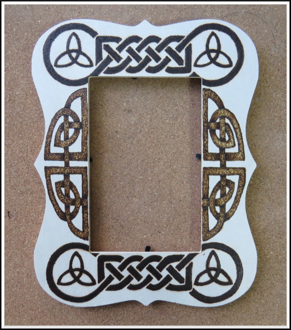 ©2016 Jennifer Georgeadis. 14cm x 20cm, wooden frame

Here’s the finished product:
 ©2016 Jennifer Georgeadis. 14cm x 20cm, wooden frame
