
About Jennifer
Follow Azure Dragonfly on Twitter:

Drop me a line and say hello!
info@azuredragonfly.ca
April 29, 2015
Looking back at Monday's post, I thought that I needed a lot more practice creating an interesting, dynamic negative image. Here are two more sketches that have a lot more going for them in terms of negative space and flow:
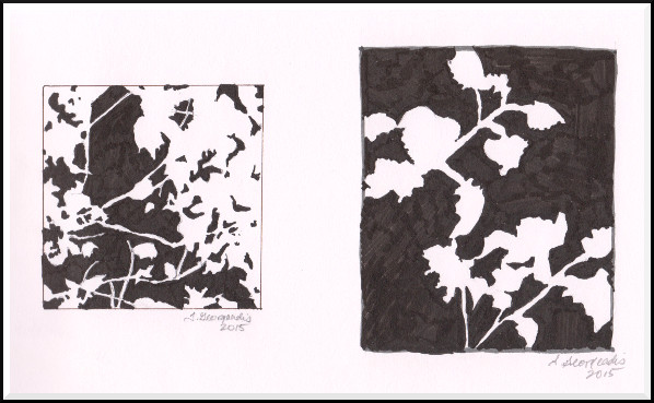
©2015 Jennifer Georgeadis. 19cm x 12cm, ink on sketchbook paper
April 27, 2015
I'm starting back at the beginning, refining my skills in planning a negative painting. I sketched a flower arrangement and simplified the lines and contours, keeping in mind how the major shapes determine the negative space in the composition:

©2015 Jennifer Georgeadis. 10cm x 10cm, digital ink on sketchbook paper
April 24, 2015
I'm playing with the negative shapes created by strong light and shadow in today's digital oil painting:
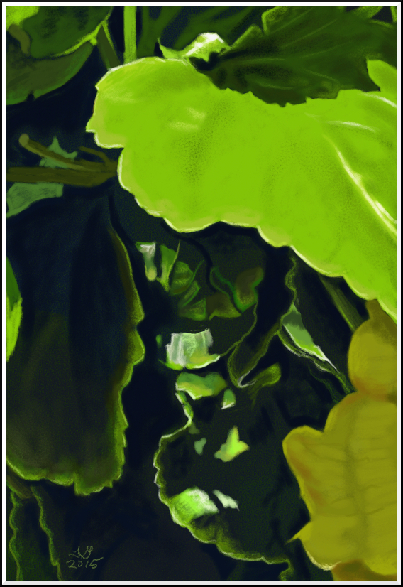
©2015 Jennifer Georgeadis. 17.5cm x 25.5cm, digital oil on pastel paper
April 22, 2015
Happy Earth Day!
This little painting was a quick one. I prepared the paper with a loose wash of various greens, then painted in a general plan for the dark shapes. Next, I painted the more detailed negative space with a mix of red, orange and white, lightening the colour value with each successive layer:
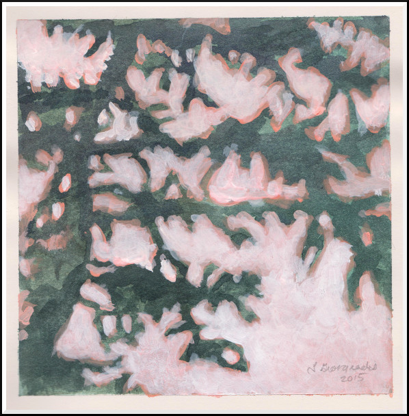
©2015 Jennifer Georgeadis. 13cm x 13cm, watercolour and acrylic on sketchbook paper
April 20, 2015
I've moved on to another negative painting, this time on a smaller scale. With the initial sketch I focused on keeping the shapes simple but interesting, while thinking in terms of the silhouettes that the shapes would make. I painted a loose wash of transparent colour over the entire surface, then moved on to the first layers of negative colour in the second stage. In the second-last stage, I was very selective about what shapes needed to be a focal point, and those that were not got pushed into the background. The last stage was to paint back in areas of light, and reduce the saturation of some of the colours on the left so that those shapes weren't competing with my focal areas.
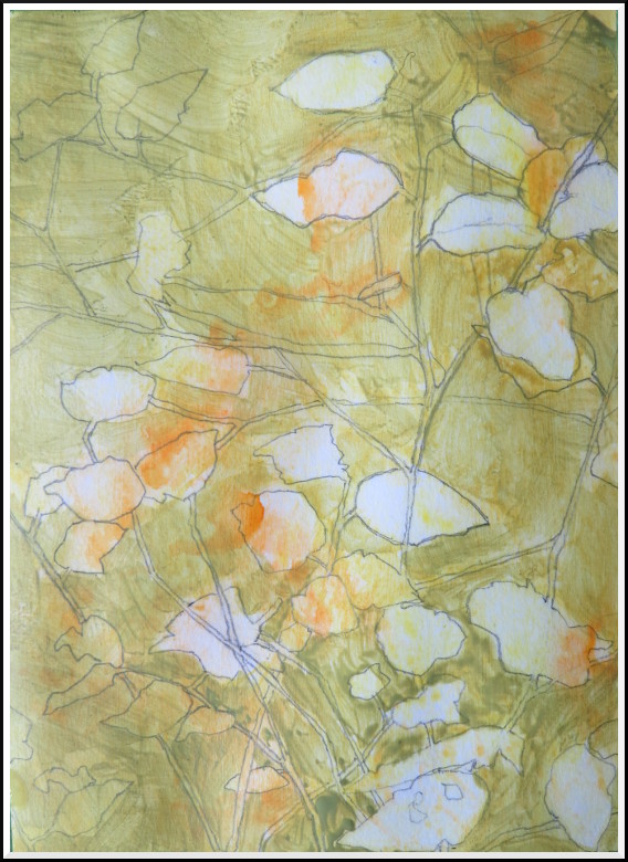
©2015 Jennifer Georgeadis. 13cm x 18cm, acrylic on sketchbook paper
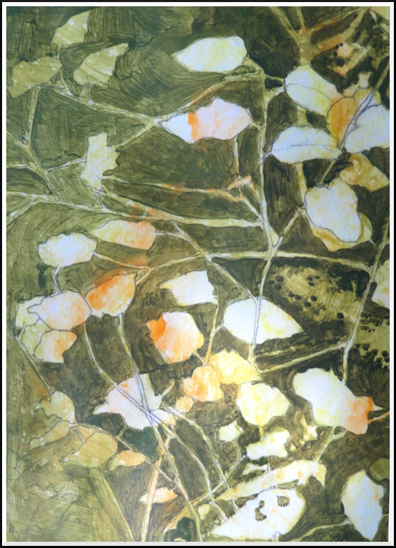
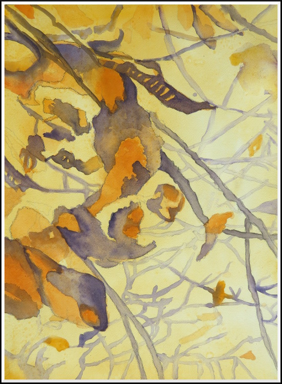
April 17, 2015
For the last step of the painting I decided to work on strengthening the focal area - the top left corner. I spent some time deepening the colour in the bottom right, while crisping up some lines to give them a bit more definition. I felt that areas of negative space in the top left of the painting lacked interest, so I began layering in increasingly lighter values of blue to pull the area forward and draw the eye.
Although I'm happy with the painting as a whole, I'm still eager to refine a few things in regards to the technique of negative painting, such as limiting colour and simplifying shapes even more!
©2015 Jennifer Georgeadis. 36cm x 50.5cm, watercolour and acrylic on Arches watercolour paper
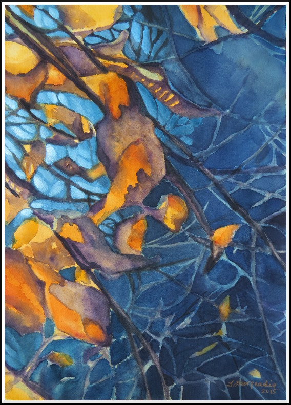
April 15, 2015
The painting's gone through a few dramatic changes today. I began by intensifying some of the shapes with pure, dark colour to make them more defined. Next, I started layering blue around my most prominent shapes, keeping in mind which areas of the painting I wanted to push back, and which areas would need to be brought forward. This process required about three seperate layers of colour to tease out subtle shapes and deepen certain areas of the painting:
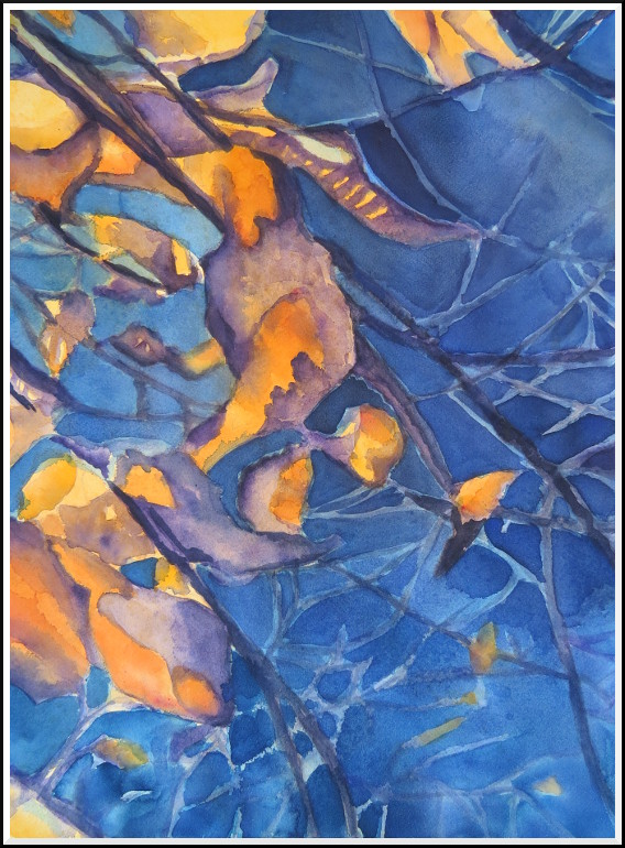
©2015 Jennifer Georgeadis. 36cm x 50.5cm, watercolour on Arches watercolour paper
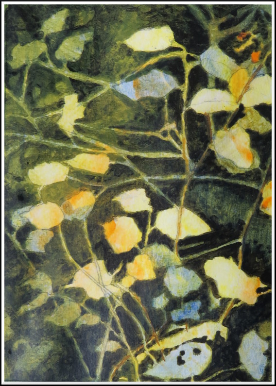
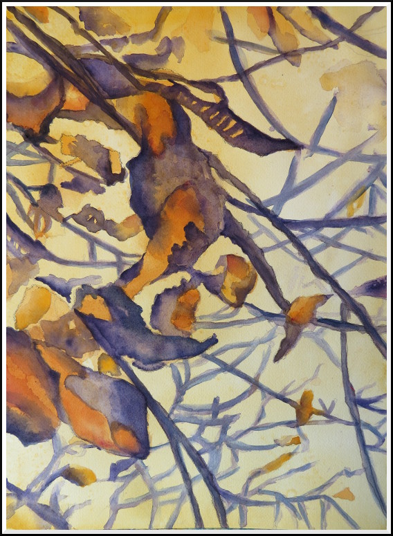
April 13, 2015
Today I roughed in the remaining shapes, then abandoned the reference photo to begin playing with what I had on paper. I intensified the orange colour with a bit of crimson, then started working on strengthening the flow of the composition.
Here's my progress so far:
©2015 Jennifer Georgeadis. 36cm x 50.5cm, watercolour on Arches watercolour paper
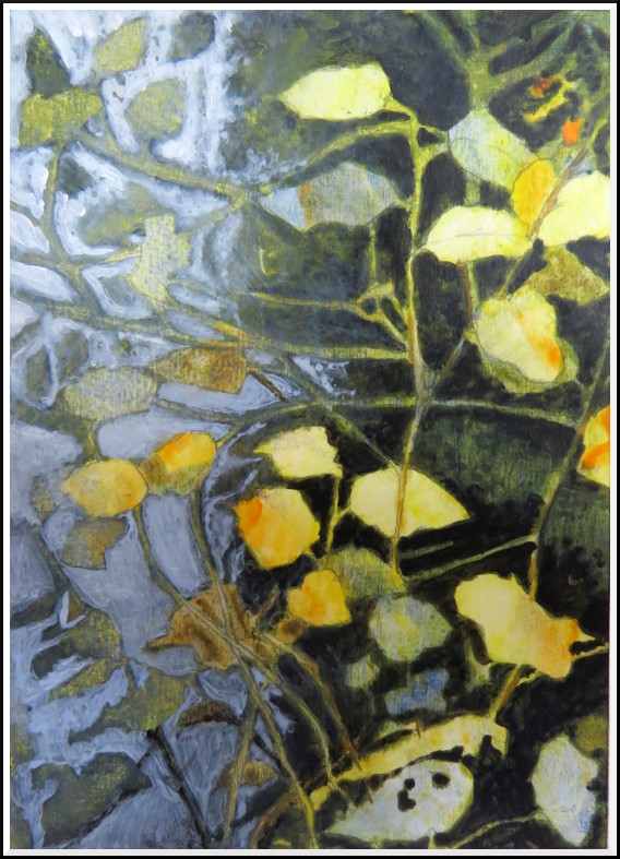
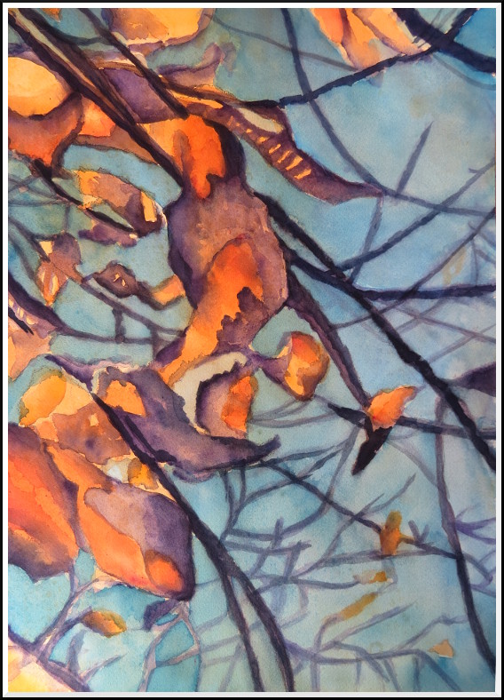
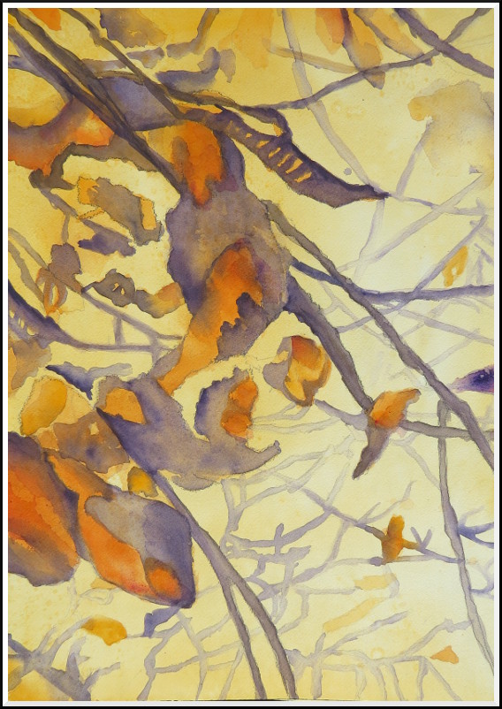
April 10, 2015
For a different challenge, I've decided to paint this negative painting using watercolours on watercolour paper. I started by transferring the image lightly onto the paper, then outlining the largest, most important shapes so that I knew where to start. I painted a warm underpainting first, then began blocking in shapes using the same colour, deepening the colour in places where there was the most vibrancy. My palette involves contrasting colours, so I began laying in darks using purple and blue-purple, often letting the underpainting show through for a variety of colour value.
I'm trying to take short breaks at regular intervals with this painting, so that I can take time to assess what I've done before moving on to the next stage:
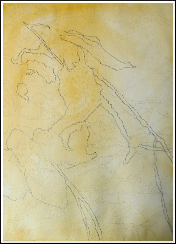
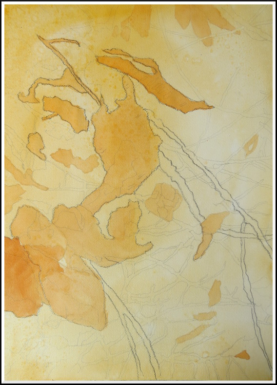
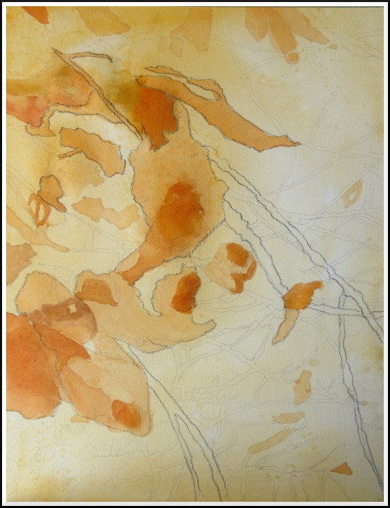
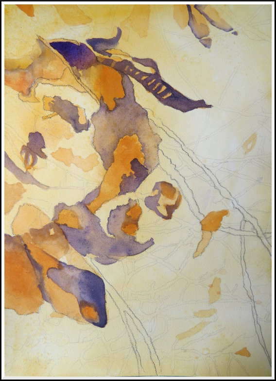
©2015 Jennifer Georgeadis. 36cm x 50.5cm, watercolour on Arches watercolour paper
April 8, 2015
I'm tightening up the composition bit by bit for this next painting. The final decisions will be made at the painting stage, but these thumbnail sketches help to give me a good sense of how the shapes and composition will work:
©2015 Jennifer Georgeadis. 8cm x 11cm, digital pastel on paper