
The everyday art and inspiration of artist Jennifer Georgeadis.
About Jennifer
Follow Azure Dragonfly on Twitter:

Drop me a line and say hello!
info@azuredragonfly.ca
February 22, 2018
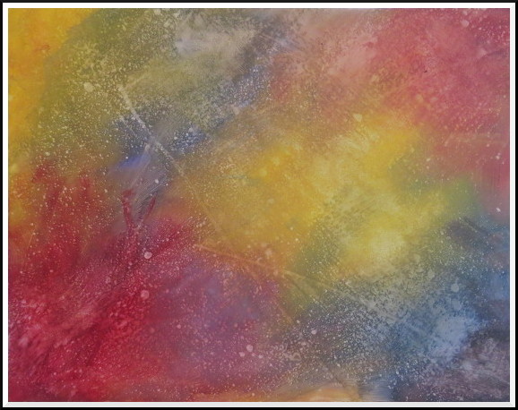
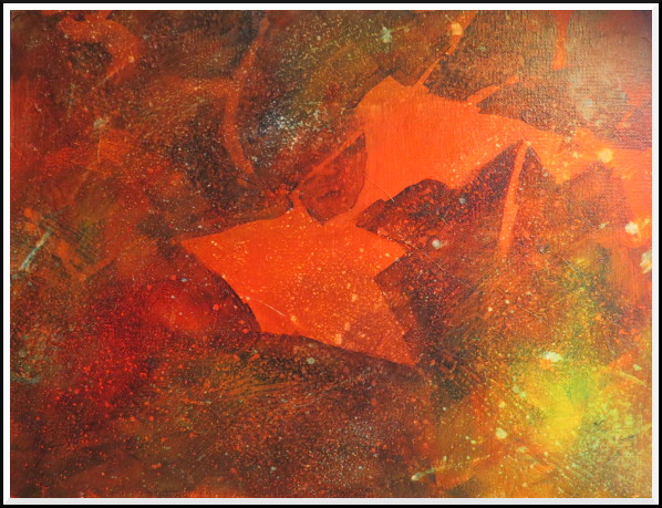
In this next stage of the painting I darkened and intensified my blue glaze and
started to work a few large shapes into the background:
©2018 Jennifer Georgeadis. 46cm x 36cm, acrylic on panel
©2018 Jennifer Georgeadis. 46cm x 36cm, acrylic on panel
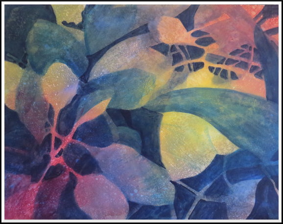
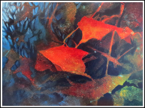
At this point I liked the shapes that I was working with, but the painting’s focal
point was unclear. At this stage I began to knock back a few shapes with a dark wash
so that the focal point in the upper right of the painting became more obvious:
©2018 Jennifer Georgeadis. 46cm x 36cm, acrylic on panel
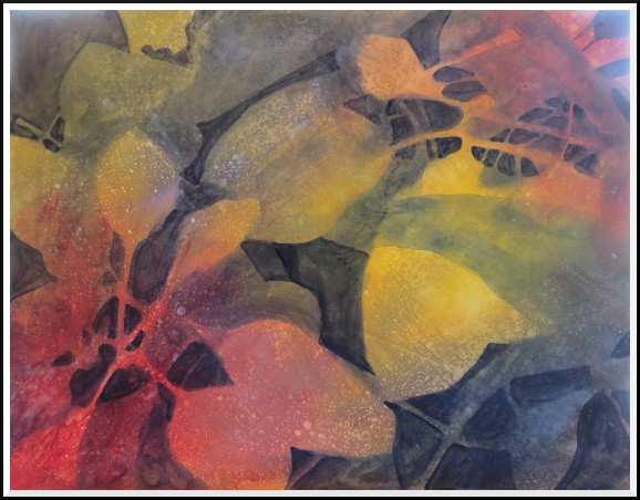
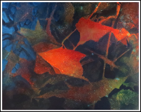
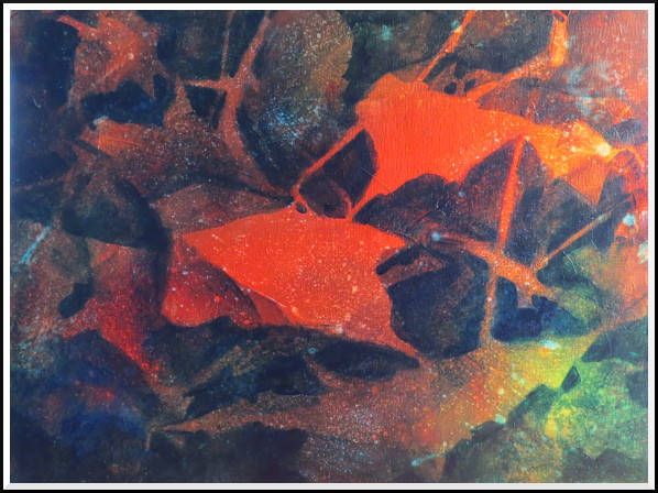
After I took a fresh look at the painting I realized that I needed to sharpen up a few shapes and work in a bit more visual texture. I was also unhappy with the arrow-shaped leaves on the right side of the composition, which looked indistinct and were a bit confusing.
In the next blog post I’ll show the changes I made to fix those areas.
©2018 Jennifer Georgeadis. 46cm x 36cm, acrylic on panel
After I took a fresh look at the painting I realized that I needed to sharpen up a few shapes and work in a bit more visual texture. I was also unhappy with the arrow-shaped leaves on the right side of the composition, which looked indistinct and were a bit confusing.
In the next blog post I’ll show the changes I made to fix those areas.
February 19, 2018
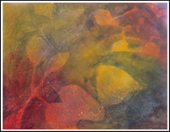
I’ve launched into another, larger negative painting. Here is the underpainting
I started with. I was careful to keep the tonal values light and to include plenty of interesting texture:
©2018 Jennifer Georgeadis. 46cm x 36cm, acrylic on panel
February 16, 2018
Sketchbook
February 13, 2018
Sketchbook
February 9, 2018
Sketchbook
February 6, 2018
Sketchbook
February 2, 2018
Sketchbook
©2018 Jennifer Georgeadis. 46cm x 36cm, acrylic on panel
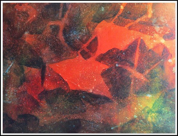
In my first layer of negative painting I kept the dark blue glaze thin, cutting around the lightest shapes:
©2018 Jennifer Georgeadis. 46cm x 36cm, acrylic on panel
©2018 Jennifer Georgeadis. 46cm x 36cm, acrylic on panel
With the next step I increased the pigment in the blue glaze and cut in the mid-to-light shapes:
©2018 Jennifer Georgeadis. 46cm x 36cm, acrylic on panel
The most challenging part of these first steps is preventing the glazes from getting too dark, too soon. In my next blog I’ll show the next stages of the painting as I work in more negative shapes and start to develop the background.
©2018 Jennifer Georgeadis. 46cm x 36cm, acrylic on panel
The most challenging part of these first steps is preventing the glazes from getting too dark, too soon. In my next blog I’ll show the next stages of the painting as I work in more negative shapes and start to develop the background.
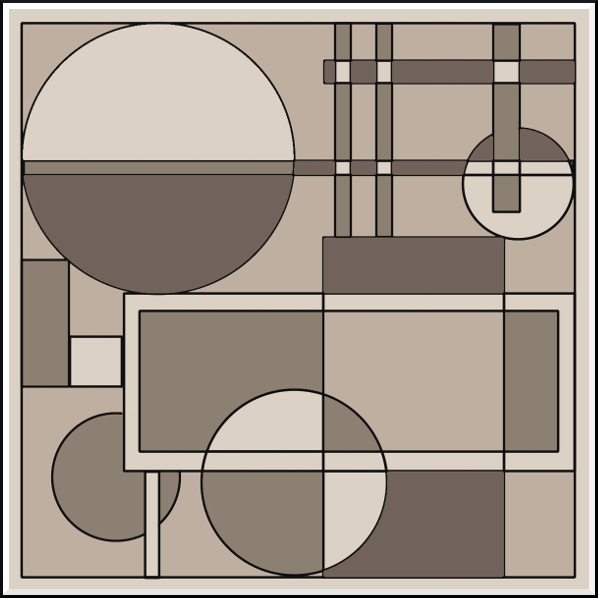
February 16, 2018
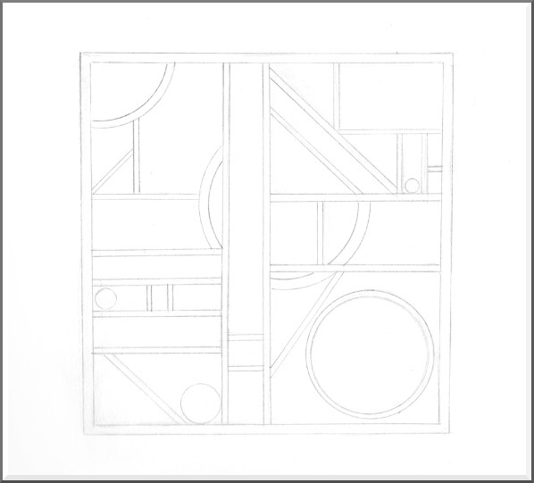
Here’s another wood carve design I’ve been playing with, this time done with a bit more
precision in a digital program. Sometimes it’s fun to play with crisp geometric shapes,
and planning this digitally allowed me to experiment with four colour fills for tonal variety:
©2018 Jennifer Georgeadis. 10cm x 10cm, digital acrylic
©2018 Jennifer Georgeadis. 10cm x 10cm, digital acrylic
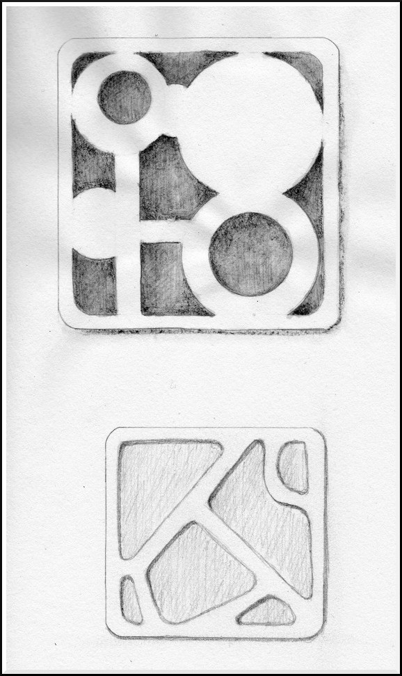
February 13, 2018
I’ve been doing quite a bit more research into wood carving sculpture, and
trying to decided whether to use hand carving tools or small power tools.
In the meantime, I’ve been sketching out a couple more design possibilities:
©2018 Jennifer Georgeadis. 15cm x 24cm, graphite on sketchbook paper
©2018 Jennifer Georgeadis. 15cm x 24cm, graphite on sketchbook paper
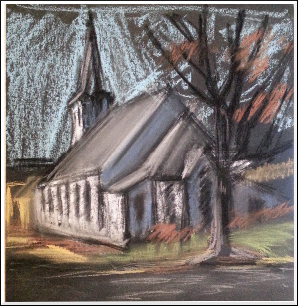
February 9, 2018
Another quick pastel painting, this time on black pastel paper:
©2018 Jennifer Georgeadis. 23cm x 23cm, pastel on toned paper
©2018 Jennifer Georgeadis. 23cm x 23cm, pastel on toned paper
©2018 Jennifer Georgeadis. 23cm x 23cm, pastel on toned paper
©2018 Jennifer Georgeadis. 23cm x 23cm, pastel on toned paper
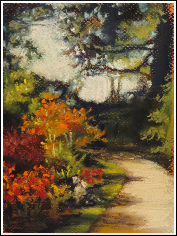
February 6, 2018
For a little break in my negative painting schedule I decided to try a soft pastel
painting to stretch my artistic skills. I began with a quick sketch on toned paper to lay in shapes:
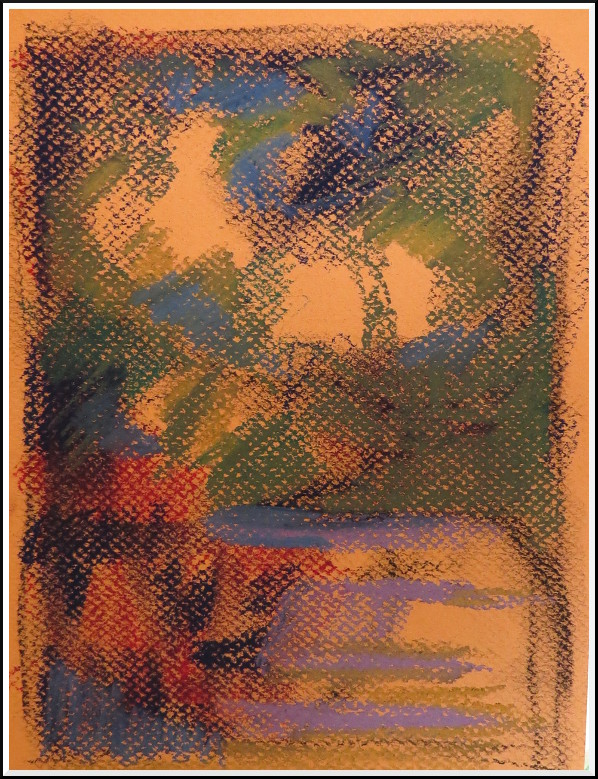
©2018 Jennifer Georgeadis. 15cm x 20cm, pastel on toned paper
©2018 Jennifer Georgeadis. 15cm x 20cm, pastel on toned paper
Next, I worked from the darkest colours to the lightest to develop the scene. I
struggled a bit with the texture of the paper because it was difficult to get solid,
dense areas of colour in such a small format. I worked around it anyway, smudging the
colour a bit as I went and then building up more saturated colours at the very last stage:
©2018 Jennifer Georgeadis. 15cm x 20cm , pastel on toned paper
©2018 Jennifer Georgeadis. 15cm x 20cm , pastel on toned paper
February 2, 2018
In the next stage of the painting I cut in around a few more shapes, then intensified
the darks where needed. Some of the larger shapes needed a wash of yellow to balance
out the colour and provide a bit more visual interest:
©2018 Jennifer Georgeadis. 40.5cm x 30.5cm, acrylic on canvas
January 31, 2018
Sketchbook
©2018 Jennifer Georgeadis. 40.5cm x 30.5cm, acrylic on canvas
The next step was to recover a few of the lights, as the painting, when viewed in
grayscale was getting a bit too dark. I used a couple of mid-tone blue colours to
create some space and light in the top left corner of the painting:
©2018 Jennifer Georgeadis. 40.5cm x 30.5cm, acrylic on canvas
©2018 Jennifer Georgeadis. 40.5cm x 30.5cm, acrylic on canvas
I extended the blue down into the bottom left corner and into the centre of the
painting for balance. Then, I reassessed the range of values again and added a
couple more tints of blue paint to push the background even farther back:
©2018 Jennifer Georgeadis. 40.5cm x 30.5cm, acrylic on canvas
This step helped the composition quite a bit, but it’s worth mentioning that this painting photographed a lot lighter than it looks in person. The red shapes in the foreground read as quite light when they’re really only a mid-tone. I’m not quite ready to call it finished until I’m certain that I have a good range of darks and lights, so more tweaking may still be necessary.
January 31, 2018
I’ve been planning several negative paintings over the past few months, and after the Christmas
rush I had a chance to get down to actually painting them. This is the first of the series.
I’ve stuck with a limited colour palette of primary colours for this painting. My underpainting was a warm wash of reds and yellows, with a little blue mixed in here and there for variety. The first step was to cut in the lightest shapes using a wash of dark blue. These initial shapes, for the most part, remained untouched throughout the development of the painting:
©2018 Jennifer Georgeadis. 40.5cm x 30.5cm, acrylic on canvas
January 26, 2018
Sketchbook
January 23, 2018
Sketchbook
I’ve stuck with a limited colour palette of primary colours for this painting. My underpainting was a warm wash of reds and yellows, with a little blue mixed in here and there for variety. The first step was to cut in the lightest shapes using a wash of dark blue. These initial shapes, for the most part, remained untouched throughout the development of the painting:
©2018 Jennifer Georgeadis. 40.5cm x 30.5cm, acrylic on canvas
This next stage shows the painting after the second group of shapes were cut in. After I painted
each stage, I spritzed the still-tacky painted surface with plain water, then brushed away the drops
to retain some interesting texture from the underpainting:
©2018 Jennifer Georgeadis. 40.5cm x 30.5cm, acrylic on canvas
©2018 Jennifer Georgeadis. 40.5cm x 30.5cm, acrylic on canvas
I used a darker blue wash for this stage in order to add depth and define edges:
©2018 Jennifer Georgeadis. 40.5cm x 30.5cm, acrylic on canvas
In the next blog post I’ll show the final steps of the painting, and describe how I fixed some unexpected mistakes.
©2018 Jennifer Georgeadis. 40.5cm x 30.5cm, acrylic on canvas
In the next blog post I’ll show the final steps of the painting, and describe how I fixed some unexpected mistakes.
January 26, 2018
For the past few months I’ve been tossing around ideas for wood sculptures or panels
that incorporate carving, wood burning and resin pouring. I like the idea of these wood
projects being a fairly intimate size – something that can easily be held in the hands.
At the moment I’m just playing around, sketching ideas and enjoying the precision of geometric designs that might translate well into sculpture. Here’s the initial sketch for a design I’ve been working on:
©2018 Jennifer Georgeadis. 15cm x14cm, graphite on sketchbook paper
At the moment I’m just playing around, sketching ideas and enjoying the precision of geometric designs that might translate well into sculpture. Here’s the initial sketch for a design I’ve been working on:
©2018 Jennifer Georgeadis. 15cm x14cm, graphite on sketchbook paper
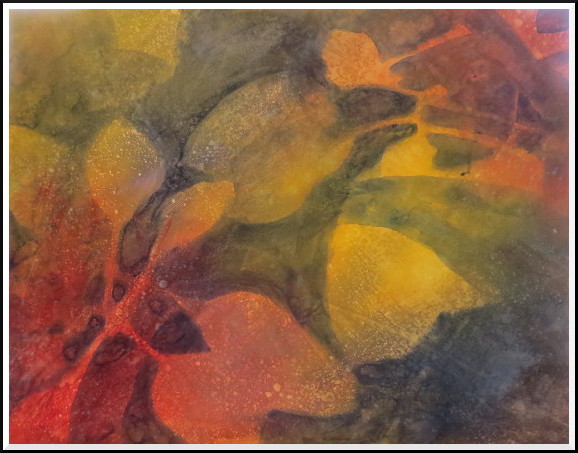
January 23, 2018
For one of 2017’s Christmas projects, I took up the challenge of painting a rather tricky landscape:
sunset on a cloudy mid-winter afternoon, just as the last rays of the sun were breaking through the
clouds on the horizon. My reference photo captured the drama of the moment, where the tops of trees
and bushes were lit in fiery colours while the rest of the landscape lay in shadow. Brilliant to see
in person and to photograph, but ultimately pretty difficult to recreate on canvas!
One of the issues with the photo reference was that the areas in shadow were so dark and indistinct that three-quarters of the composition was a blur of mid-to-dark greys and browns. I reworked those areas to enhance the shapes and contrast. It was at this point that I realized what I loved most about the scene was the striking shapes and contrasting colour, so I decided to push the composition towards abstraction a bit more. With that in mind, here are the first two stages of the painting with initial shapes and colour worked onto an orange-red underpainting:
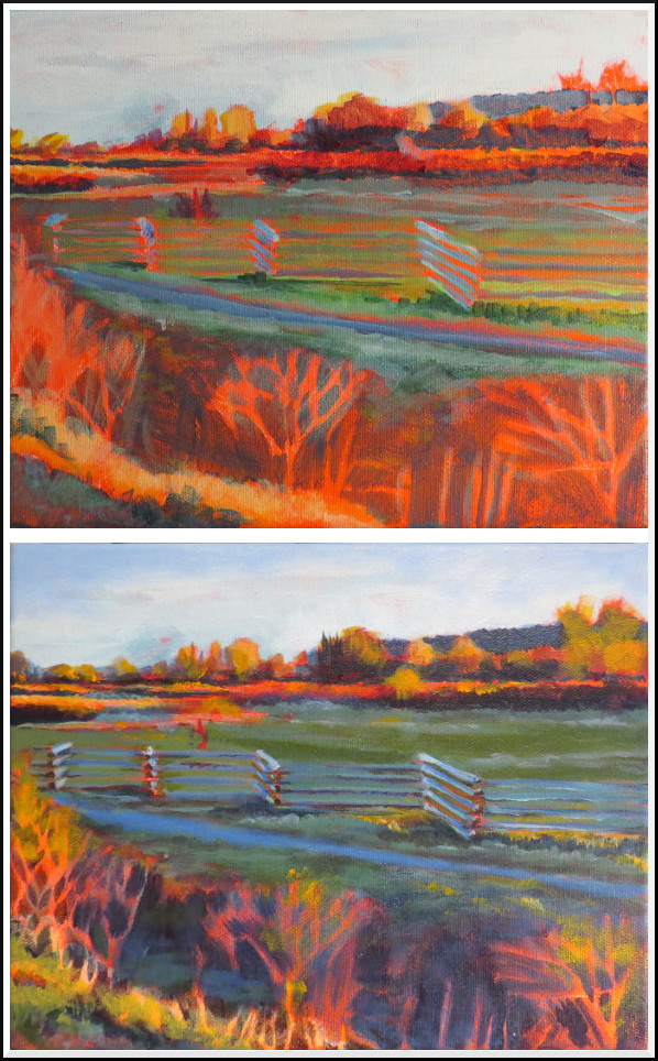
©2018 Jennifer Georgeadis. 26cm x 22cm, acrylic on canvas
© 2011-2022 Jennifer Georgeadis.
One of the issues with the photo reference was that the areas in shadow were so dark and indistinct that three-quarters of the composition was a blur of mid-to-dark greys and browns. I reworked those areas to enhance the shapes and contrast. It was at this point that I realized what I loved most about the scene was the striking shapes and contrasting colour, so I decided to push the composition towards abstraction a bit more. With that in mind, here are the first two stages of the painting with initial shapes and colour worked onto an orange-red underpainting:
©2018 Jennifer Georgeadis. 26cm x 22cm, acrylic on canvas
The lacy, fragile bushes in the foreground were shadowy and indistinct in my reference photo,
so I intensified them to balance out my composition. When the shapes got too fussy, I painted
over them and decided to incorporate some rough impasto to get the broken lines and texture
I was looking for. The final stage was to intensify the shadows to create a bit more contrast
against the brilliant reds and yellows. Here is the finished painting:
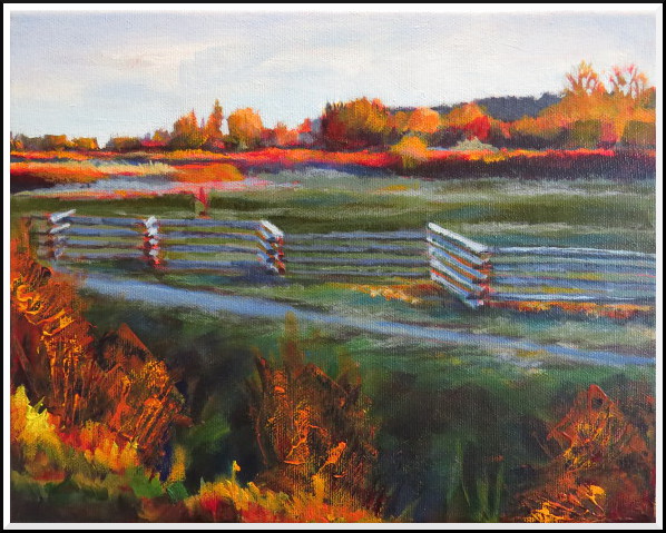
©2018 Jennifer Georgeadis. 26cm x 22cm, acrylic on canvas
<--- Newer Older --->
©2018 Jennifer Georgeadis. 26cm x 22cm, acrylic on canvas